75 photos
The unique potential of the modern method for three-dimensional visualization of the interior will allow you to look ...
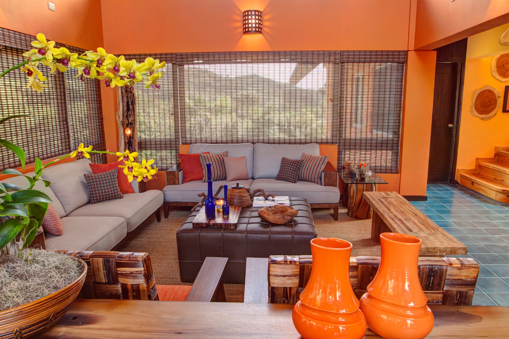
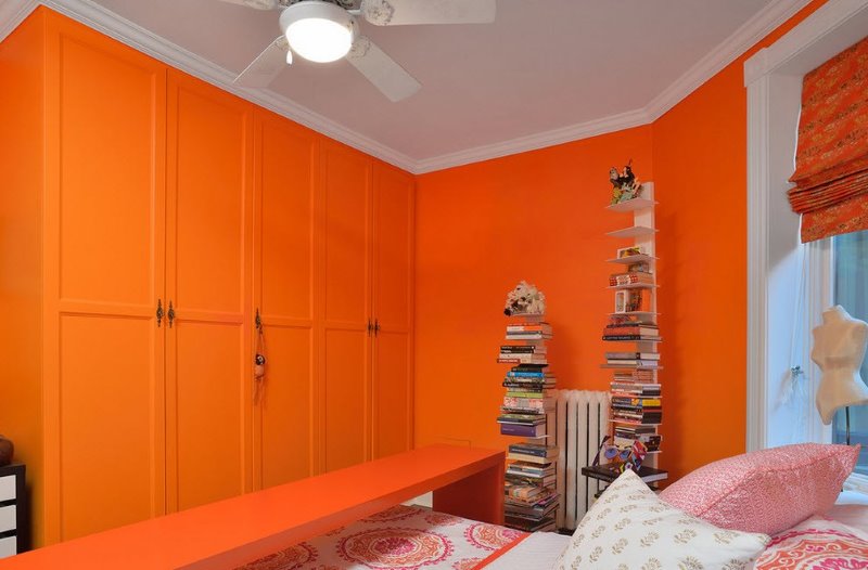
Not so often there is an orange color in the interior of modern apartments, but a few orange accents can make the kitchen cheerful, and the gray bedroom - cozy. Each design idea should be embodied in a well-thought-out concept in which the proportional ratio carries the main load in the overall balance. Orange is a rare color, which does not have as many shades as, say, green or brown, with a cold gamut it is "not friendly." Therefore, if you want to use it in one of the rooms of your house, listen to the advice of our experts - colorists, psychologists and designers.
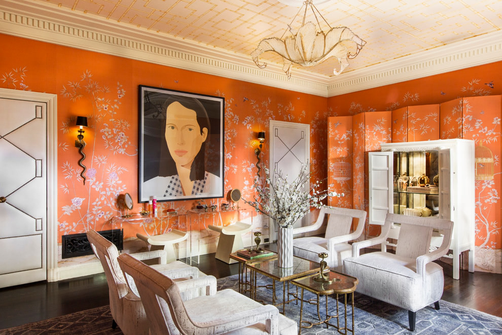
Orange is the warmest color in the designer’s palette, regardless of presentation and combination with other tones
Content
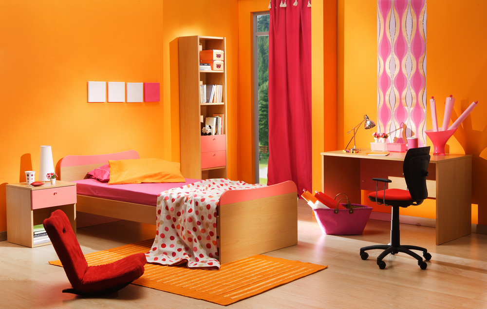
Orange, like any other, each has its own associations, evokes certain memories. Many remember the happy colors of childhood, among which, of course, there is also something orange. Most likely, these are New Year's tangerines or summer apricots, bright dresses or colored candies. But the orange color is applicable not only in the interior of the children's room, but also in any other room, including the hallway and bathroom, as in the photo.
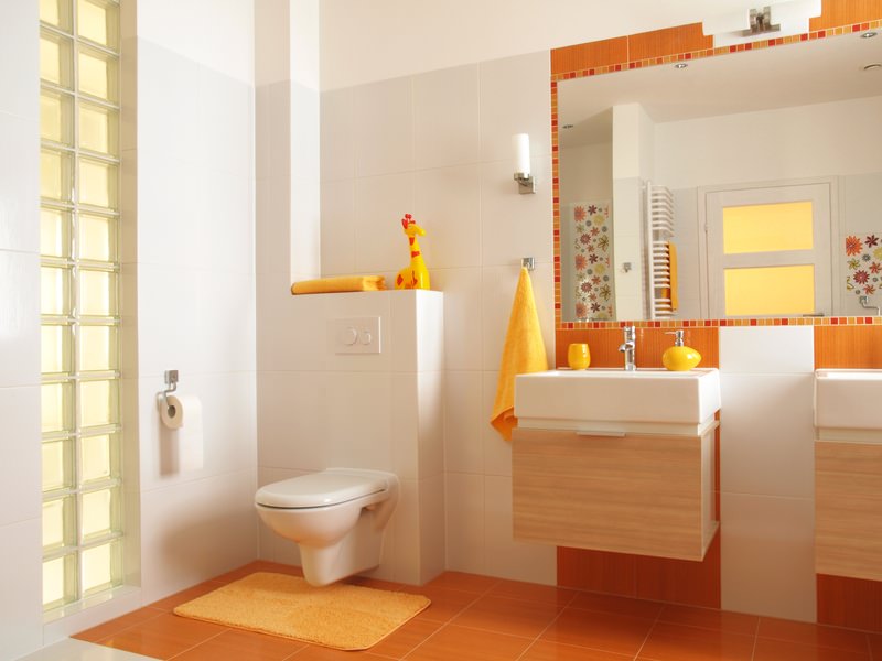
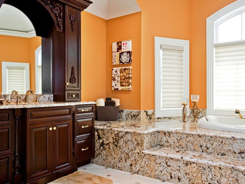
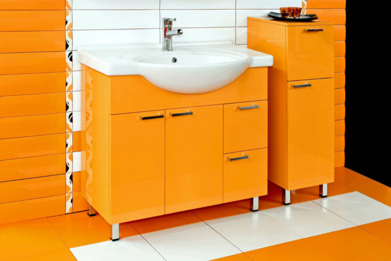
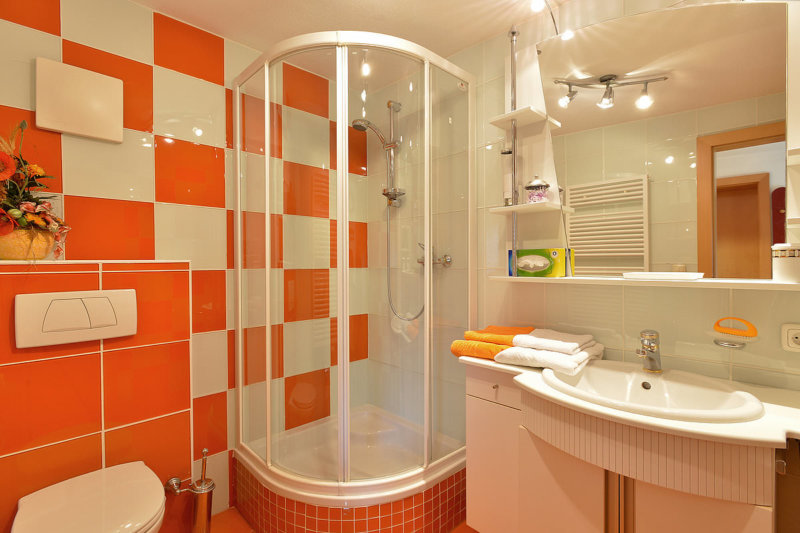
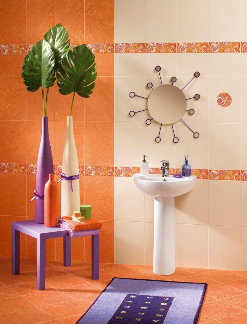
Energetic young people with an active lifestyle will love this bathroom.
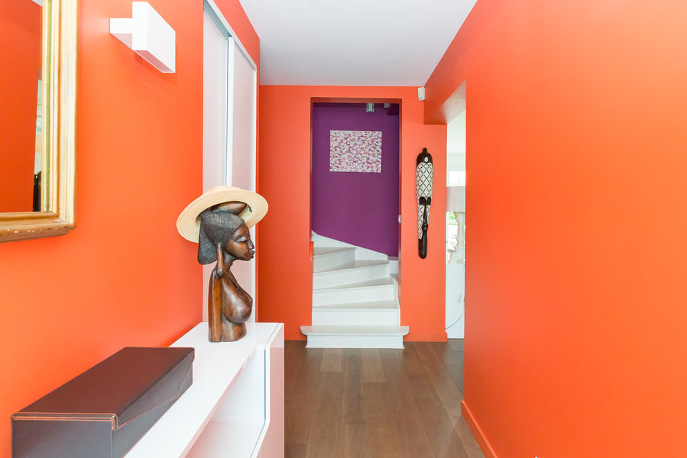
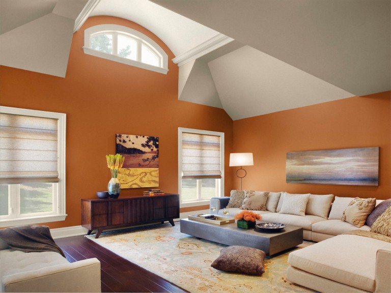
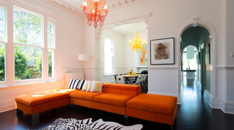
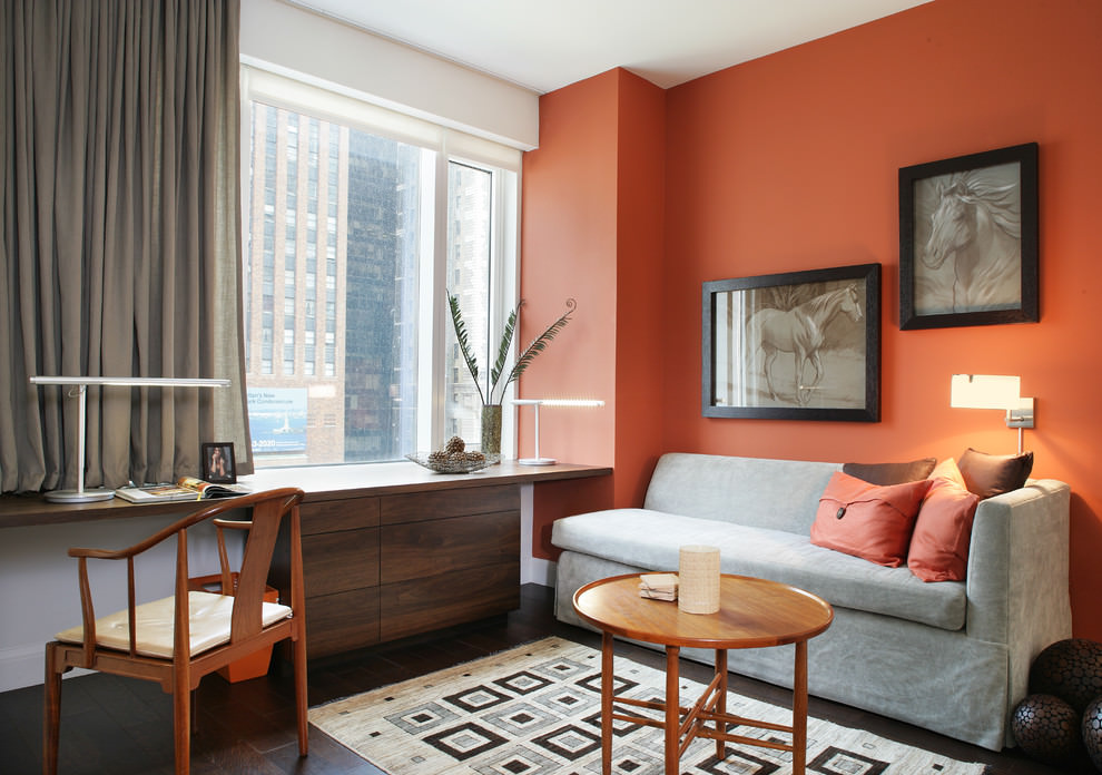
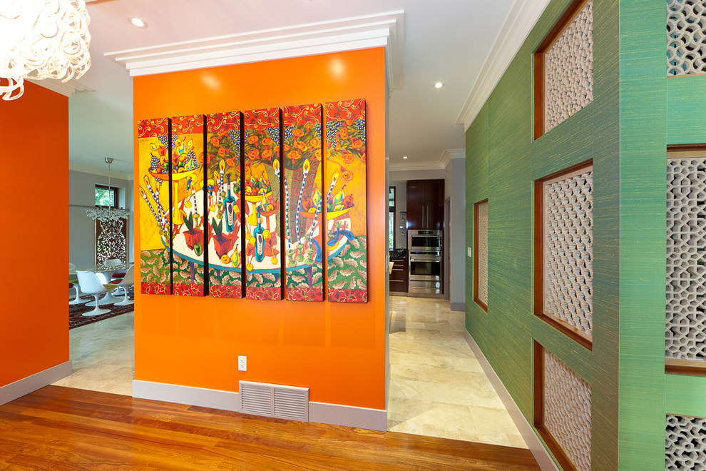
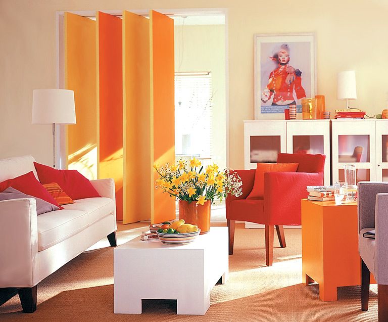
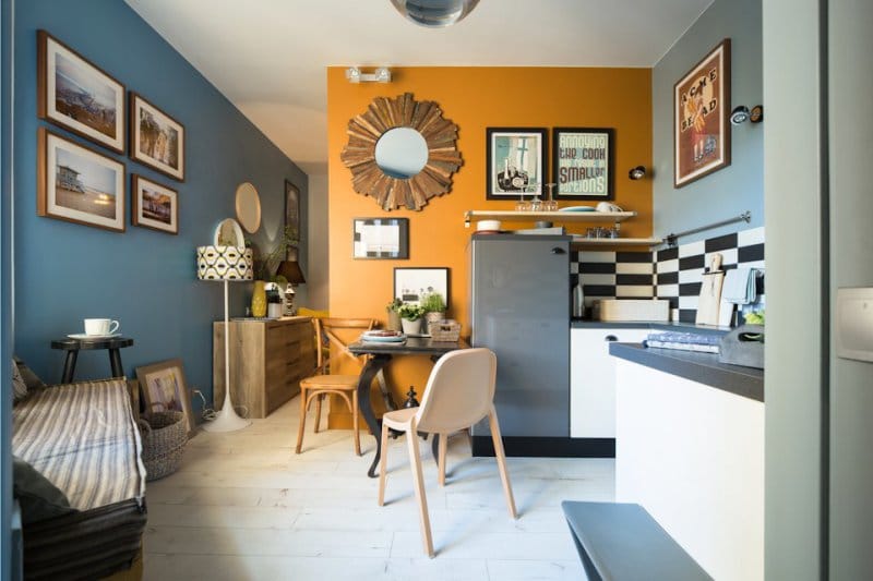
Hallway with orange walls
When you enter the room, your eyes immediately linger on orange objects
Important! This color slightly distorts the real perception of nearby objects.
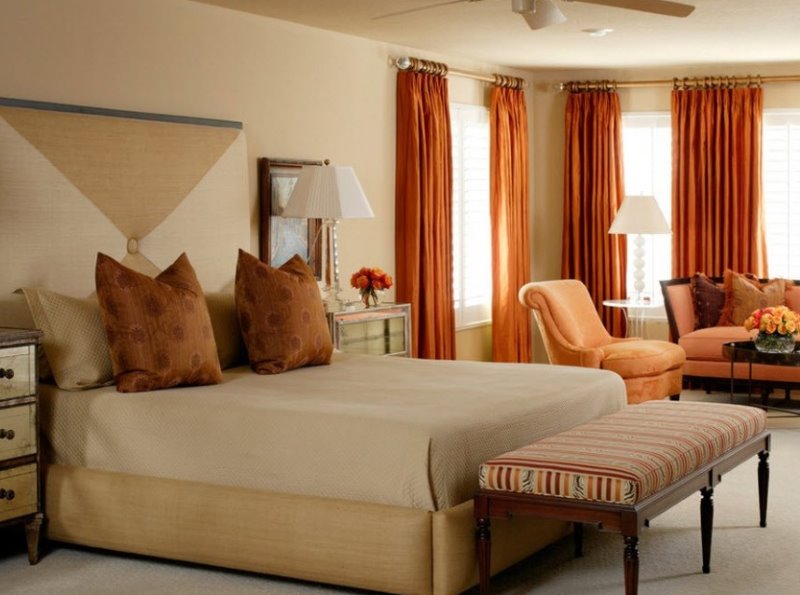
In a mirror image against a background of orange walls, a person will appear prettier, fresher and younger than in reality. The same property works against the background of the apricot walls of the bedroom, which is often used by the elderly aristocrats of Misty Albion.
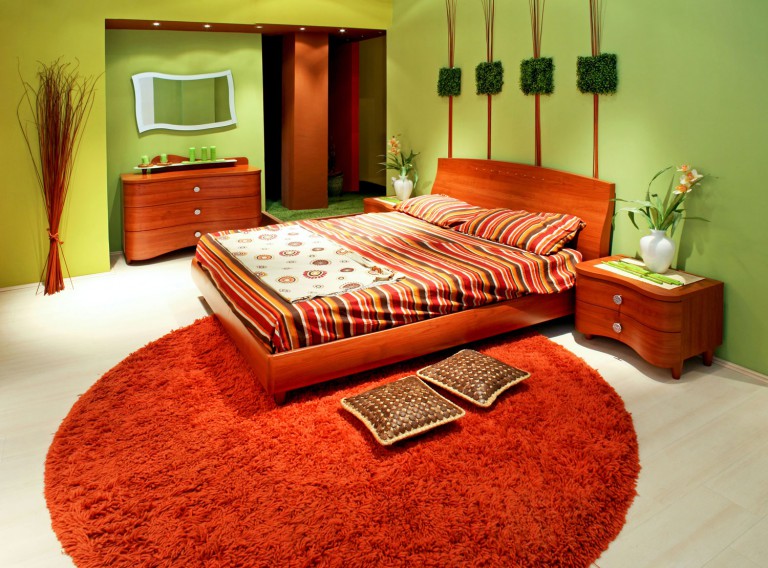
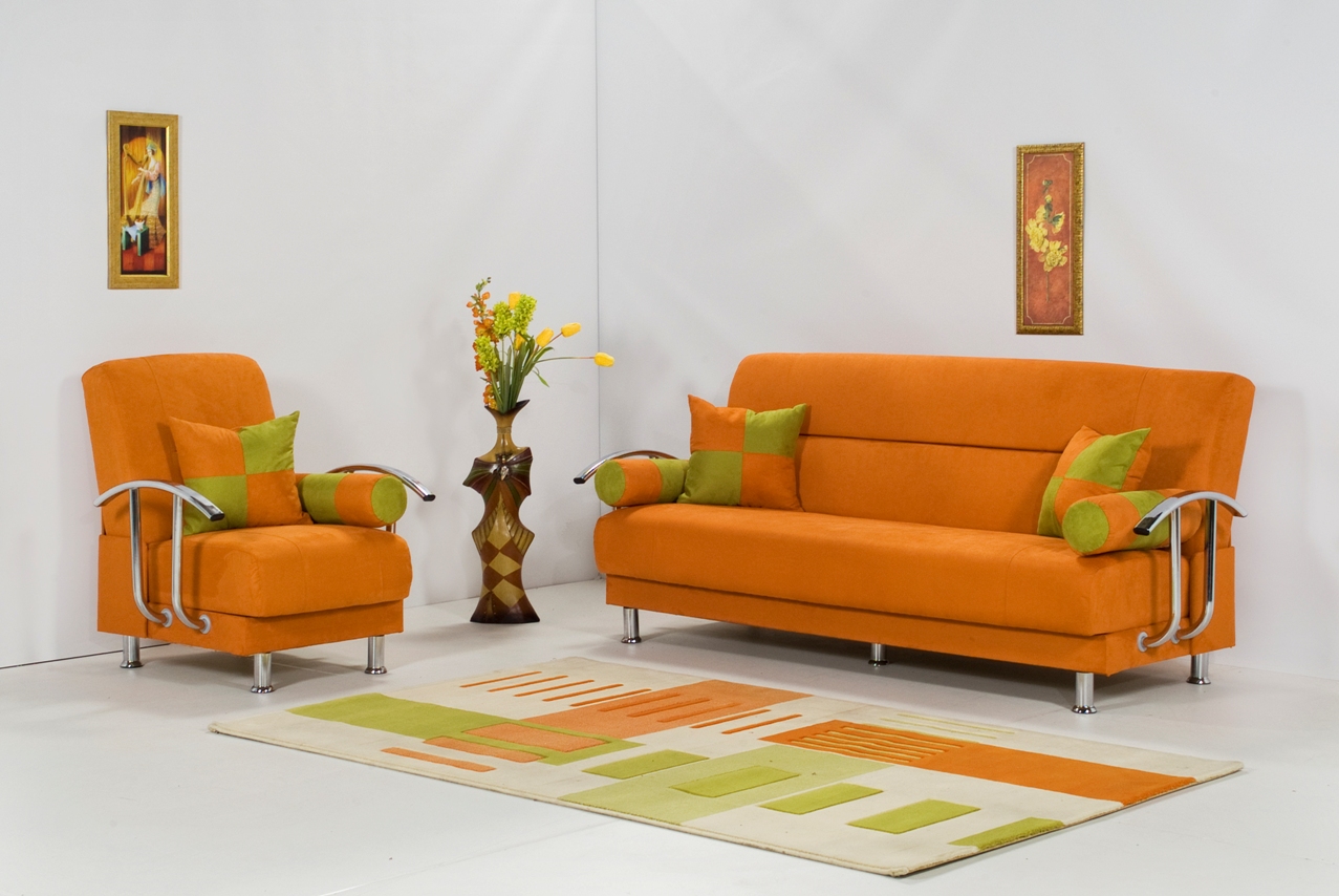
Orange and green are a natural composition created by nature itself. Any shades are acceptable: olive, pistachio, mint, emerald, salad and so on.
This sunny color has its own characteristics. Even if it is a “classic” or spectral color, it is used differently in the interior:
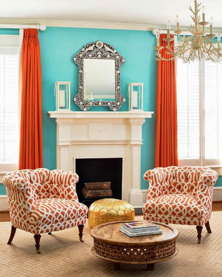
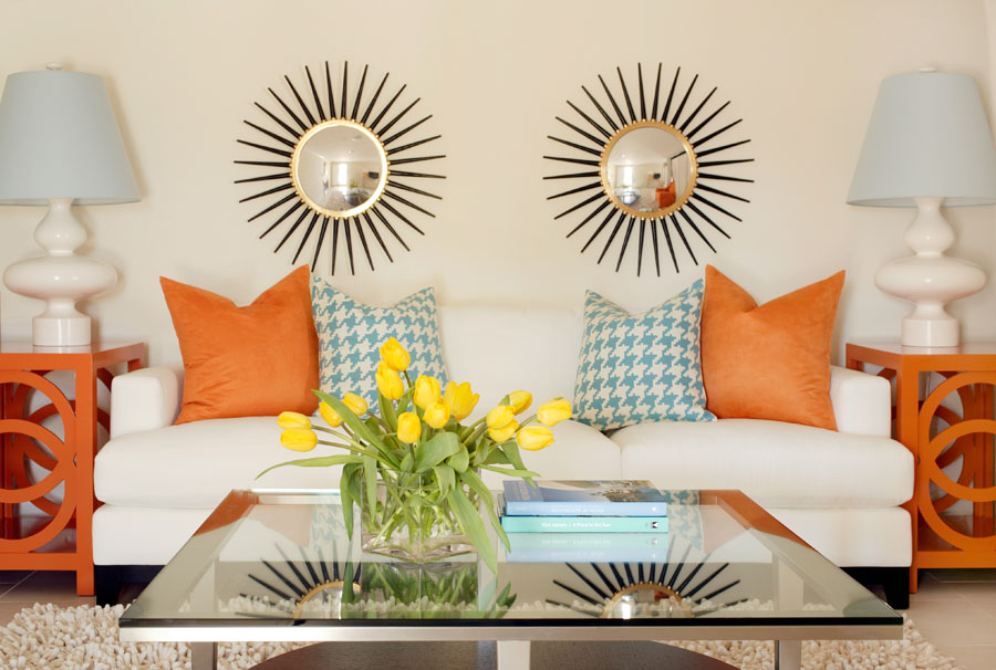
A light shade of orange goes well with cool blue or turquoise
Tip. Due to the ability to mix, use that interior paint that is available, but vary the shade by adding another pigment or a finished base. For walls, blurry and diluted tones are more suitable, for bright accents, you can enhance the emotion by adding red pigment.
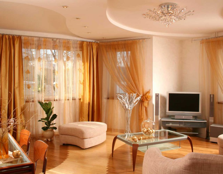
Beige and orange are one of the most harmonious combinations. The interior looks cozy and noble
Psychologists claim that this part of the rainbow spectrum, transitional from red to yellow, has many positive characteristics:
The duo of orange and purple is only suitable for futuristic interiors. Adding gray accents will make the atmosphere more harmonious.
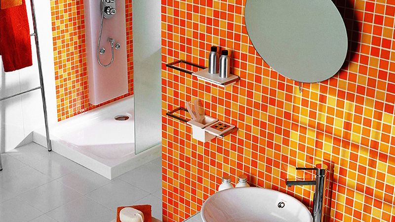
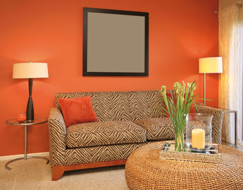
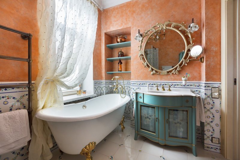
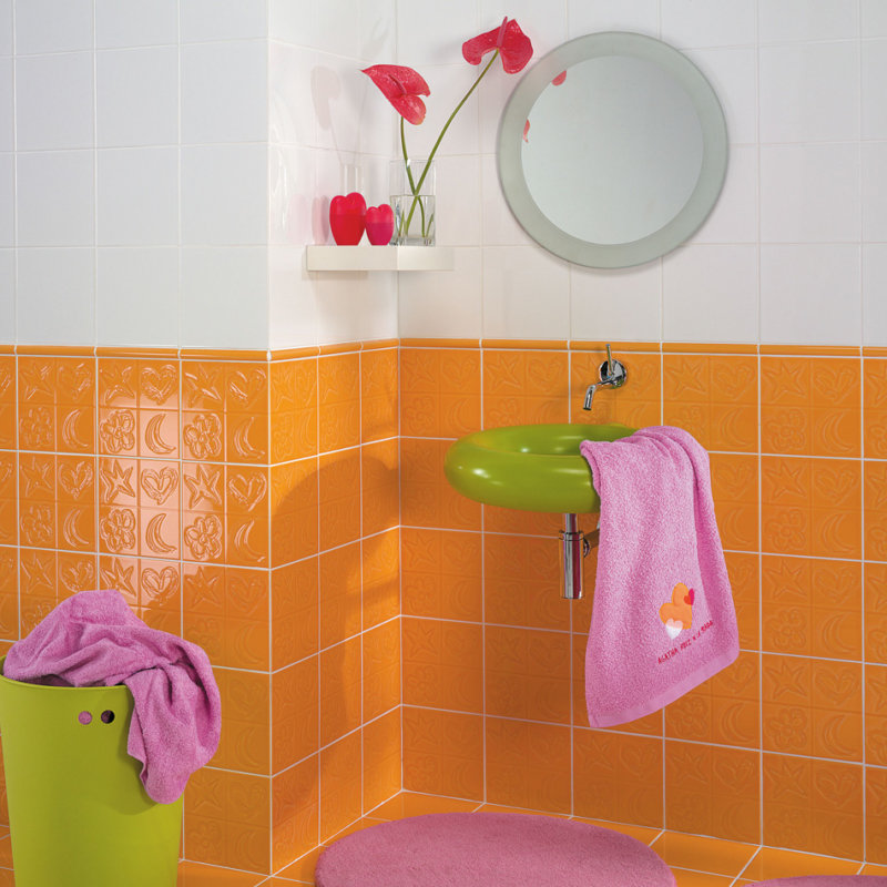
Attention! Do not use a two-tone combination of black and orange in the interior, for example, in an extravagant bathroom. In nature, this is a danger signal in reptiles and insects. But this duet can be diluted with a milky or delicate beige shade.
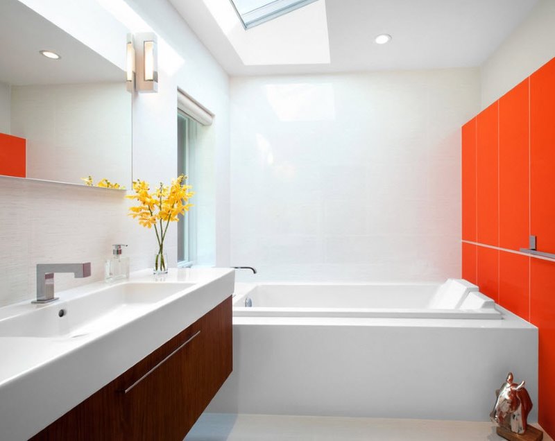
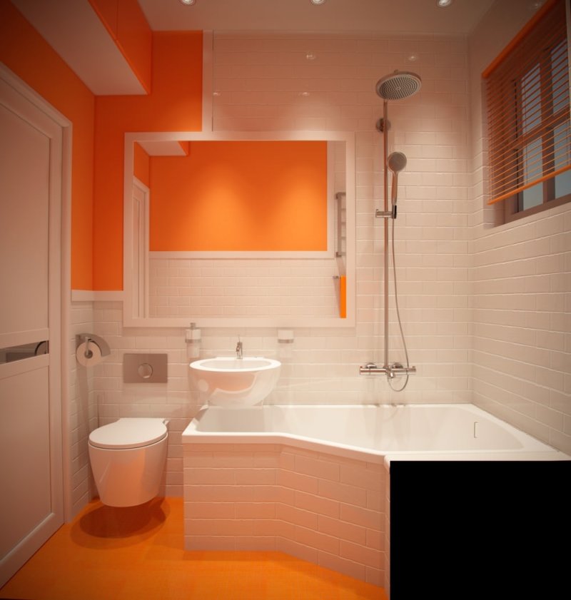
In this bathroom, pure white color is charged with the energy of orange and invigorates in the morning
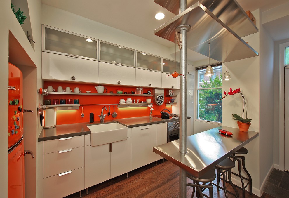
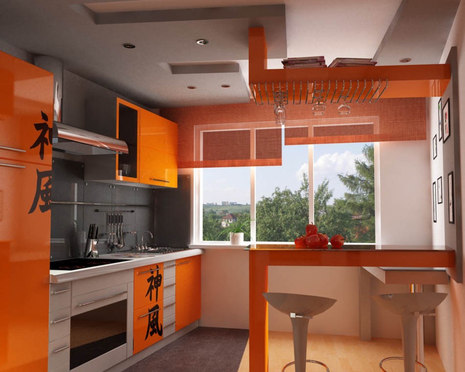
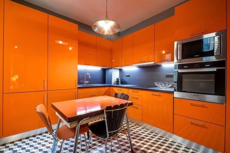
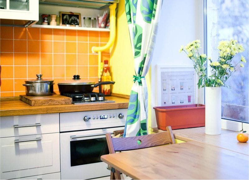
The excess of orange in the interior as the main gamut at first activates, then tires and depletes. In addition, against the background of orange furniture in the kitchen, paler objects will “get lost”. But in a modern design, made with a reasonable use of its shades, plastic furniture and glass shelves look great. Even a small kitchen with a northern window will look more spacious, saturated with light and air, as in the photo example.
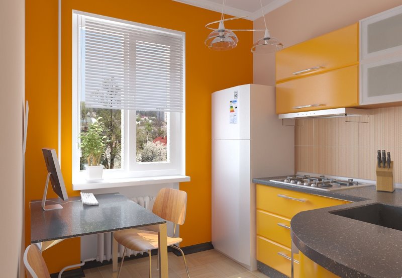
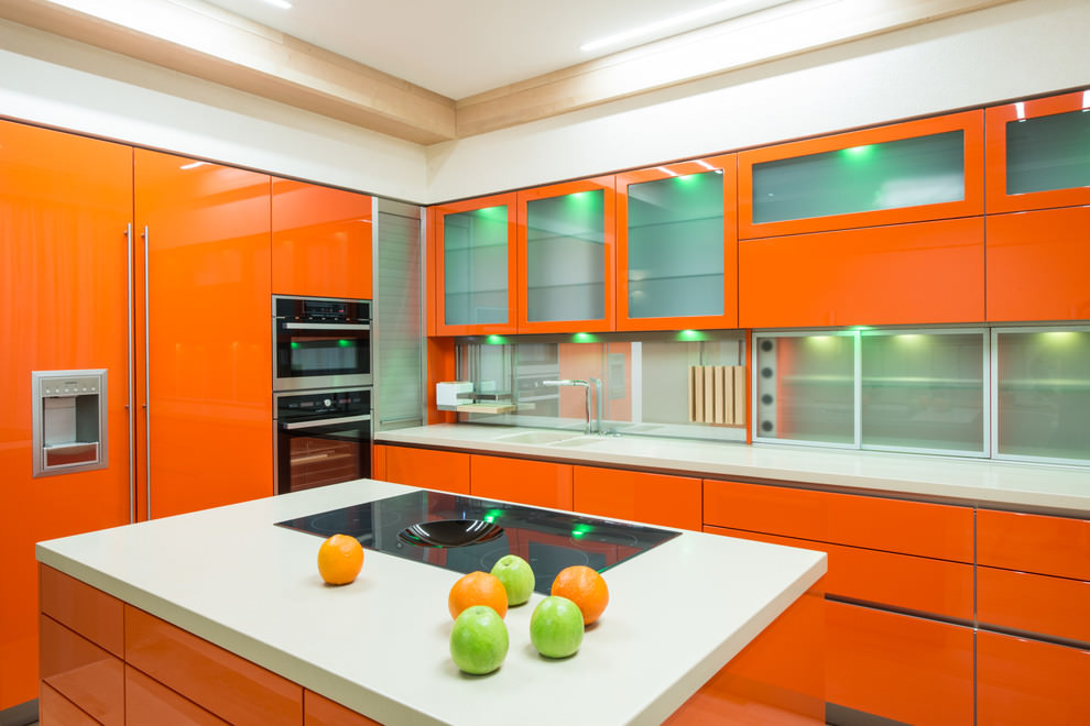
By painting the wall orange, you will make the kitchen visually wider and more spacious
Psychologists say that orange choose extraordinary, gifted personality. All the rest, too, would do well to add a little of these accents to the interior to make it easier to survive the long northern winter or seasonal depression. To do this, you do not need to radically change something or wallpaper the orange walls in the interior, just add a few bright emotional accents to the apartment.
Designers consider the orange color in the interior optimistic, cheerful, so it does not fit into a restrained calm concept. Although its blurry tones in textiles or fur elements are not excluded, because its red tint is associated with fox skins.
A plain minimalist bedroom interior is decorated with a veil imitating red fur. This is a great winter setting for a seasonal transformation of the atmosphere. In the living room, add some “fur” accents in the form of souvenirs, paintings or photos with a red-striped pet - the room will be filled with vibrant energy.
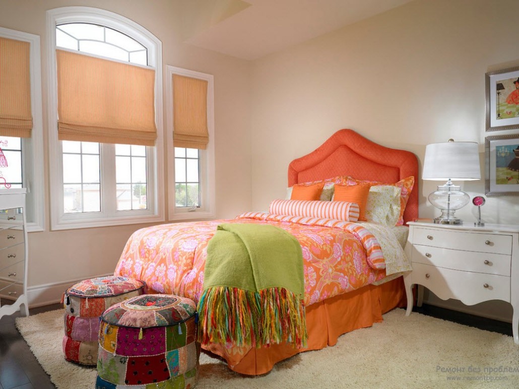
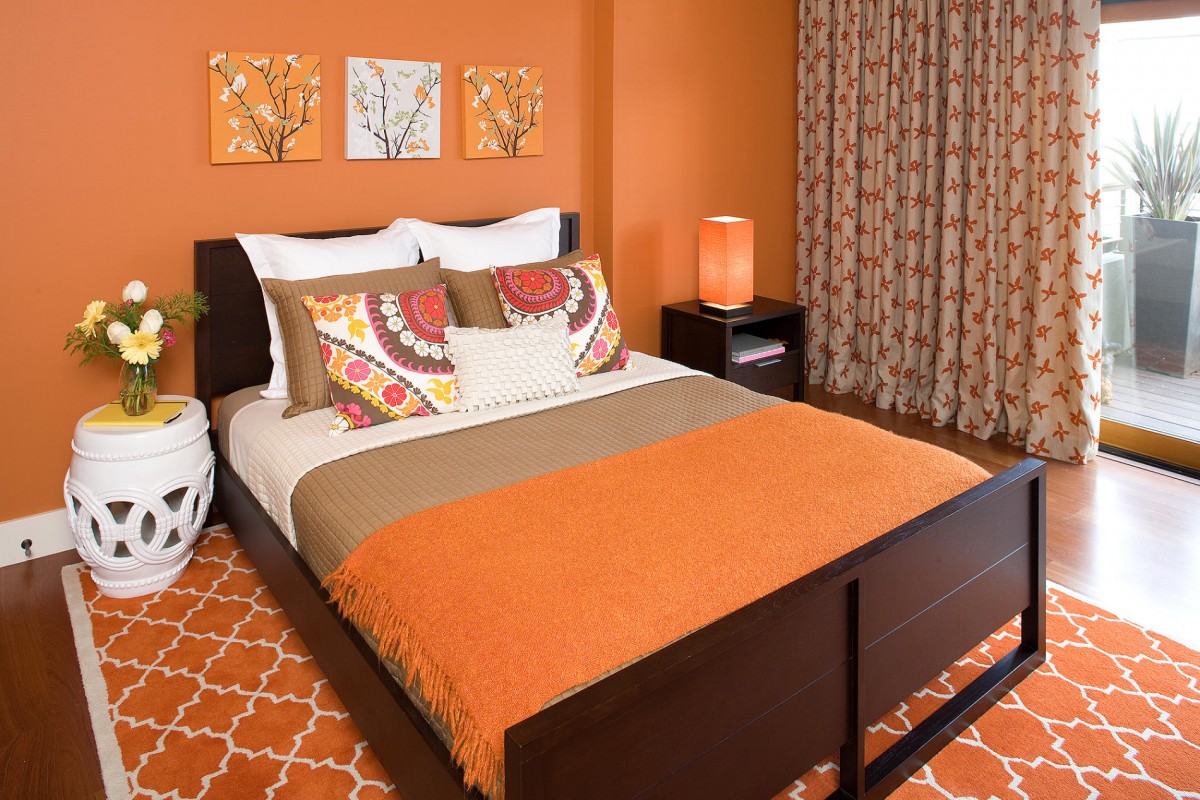
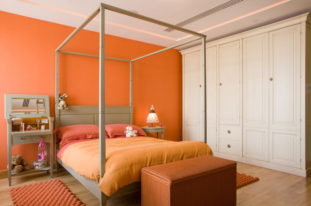
When the light in the morning passes through the orange curtains, the bedroom will be filled with good mood and a boost of energy
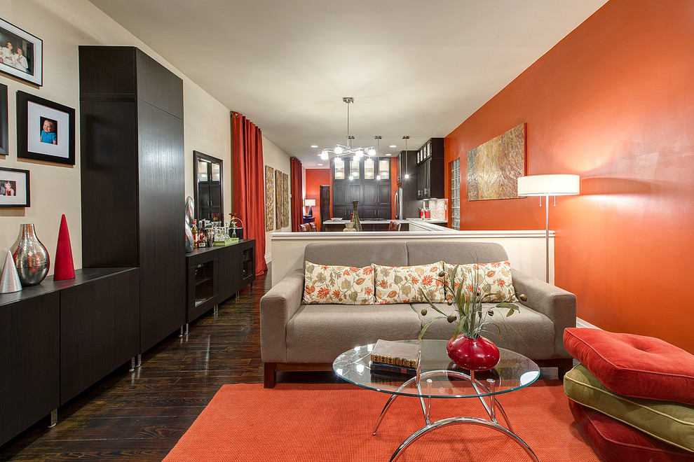
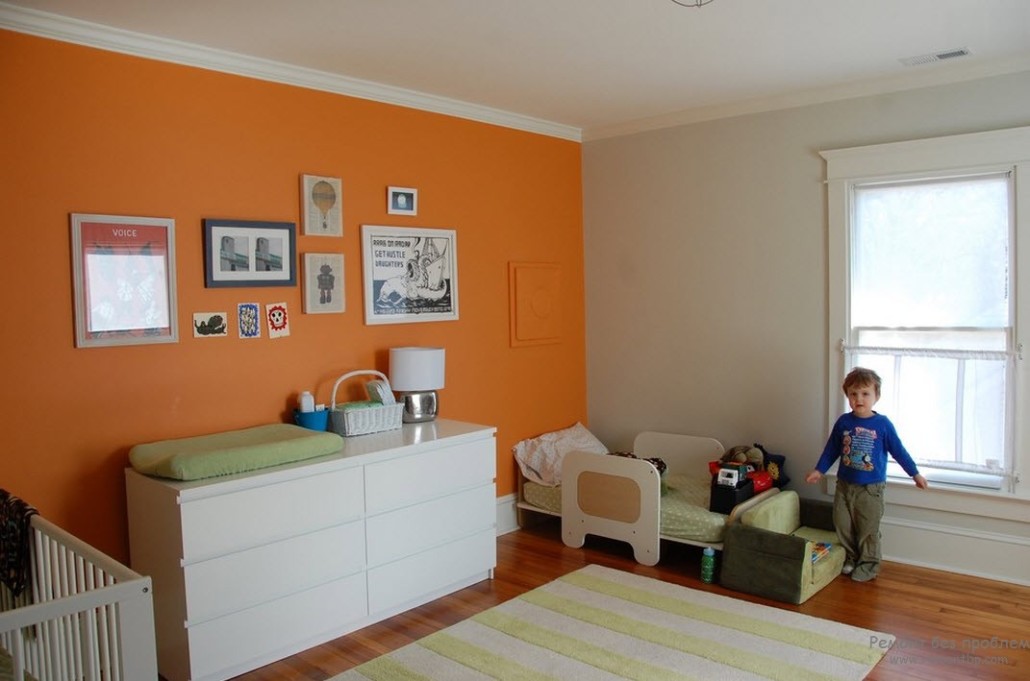
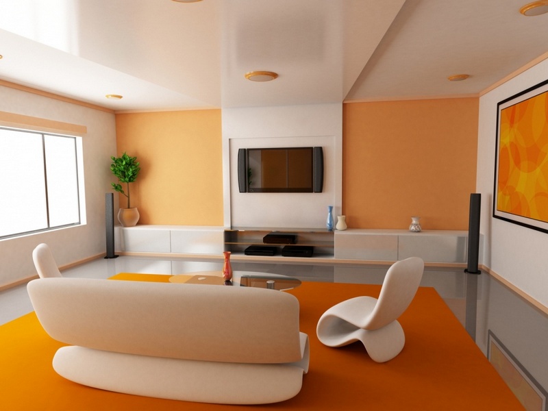
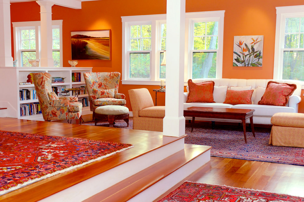
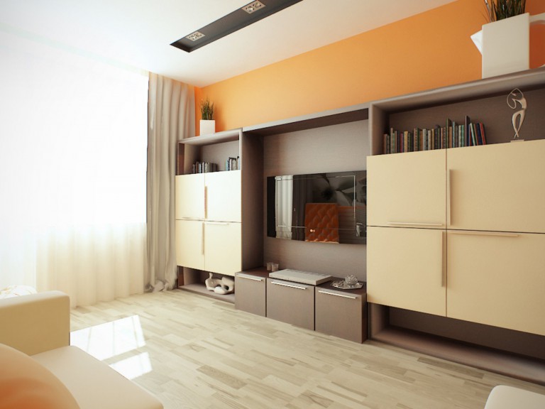
The interior of the modern style is dominated by straight lines and a solid color, one of the walls can be highlighted in orange
However, there are many styles where the orange color and the fur theme are inappropriate, for example, the Renaissance, Empire style and some historical stylistics.
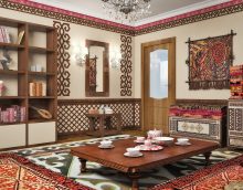
Terracotta, as one of the shades of a warm favorite, will fit perfectly into the country style and many ethnic interiors. The riot of colors with the participation of emerald green and terracotta elements is a favorite technique in Arabic-themed styles - Turkish, Moroccan. The refined African interior with imitation of giraffe skins is inconceivable without it.
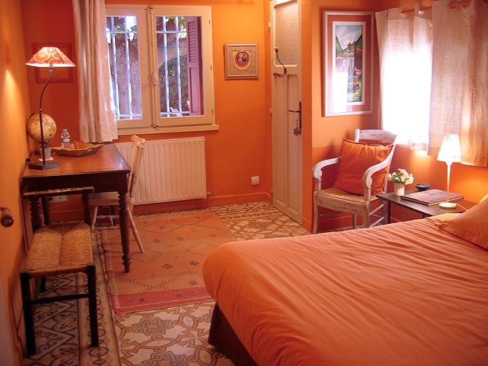
Provence style orange bedroom
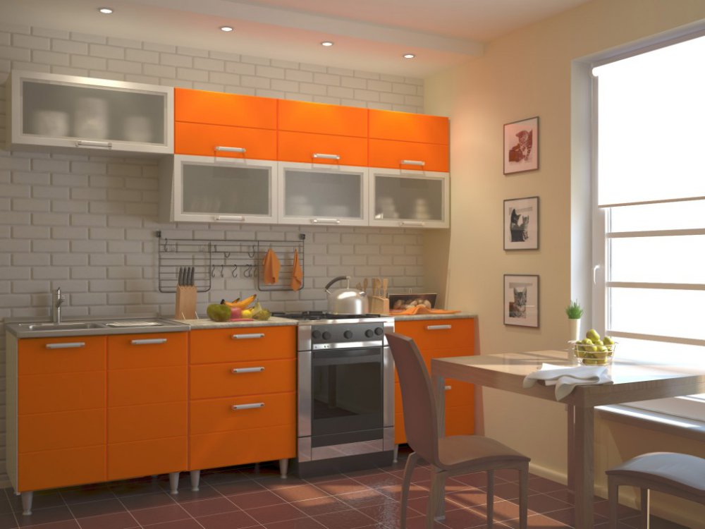
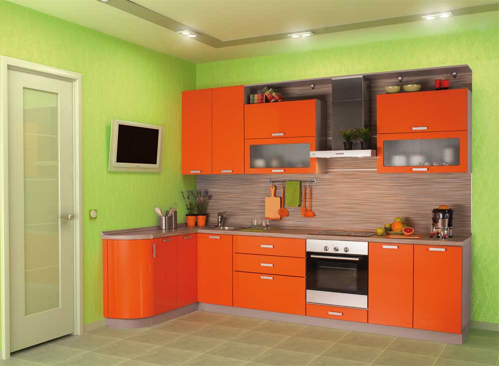
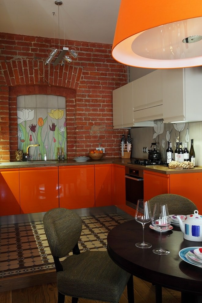
In kitchen furniture, this color remains quite acceptable in most stylistic decisions. This is, first of all, fruit and citrus motifs that can decorate an emphasized urban kitchen interior in the style of hi-tech or loft, with its brickwork.
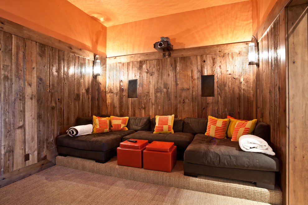
An orange ceiling will make any room unique, such as this country-style home cinema
Eclecticism, kitsch and fusion are modern stylistics, where the emphasis is on mixing the characteristics of different directions of the interior with orange walls or elements. Dosing of this gamut, with skillful combination with traditional partners, will help to avoid mistakes. For these trios and duets are most suitable:
Black-and-orange combination is appropriate for art deco style.
Tip. Do not rush to experiment with the cold gamut, if you are not convinced in the photo examples that this is good. The exception is colorful textiles, without which the furnishings of a house furnished according to the Indian, Arab or Chinese traditions are unthinkable.
Bright facades of the orange headset look beautiful in combination with white or cream wall decoration
Some people wonder what color doesn’t match orange in the interior? Stylists call blue - the tone opposite in the spectral circle. Much “incongruous” can be successfully combined in eclectic or extravagant interiors, but in the classic do not combine indigo and terracotta, shades of apricot and turquoise.
Important! Do not forget that some duets can subconsciously depress the psyche, and living space is the place where you have to spend most of the time.
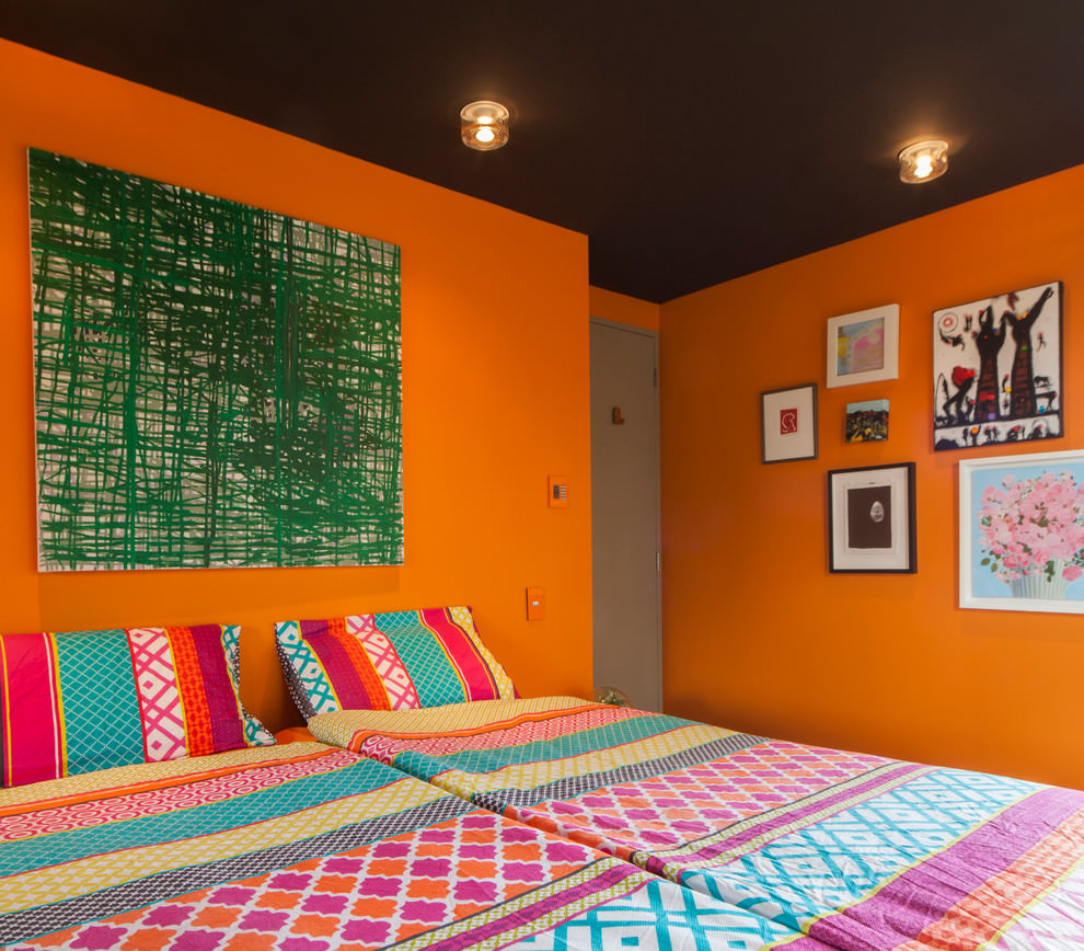
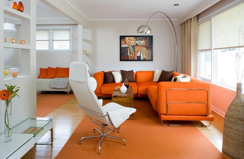
Bright and saturated bedroom - an option for the bold
Professional designers manage to effectively combine it with "hostile" tones. But this connection is made successful through color intermediaries or other tricks. You can use metallic accessories, wood texture or a pale neutral background of the walls with orange in the interior - beige or pearl gray.
Fans of avant-garde, futurism or expressionism are acceptable even acidic shades. But it is better to equip a bright orange backlight or arrange an interesting object, for example, a chair-bag in a bright cover in the corner of the room. This will not tire the optic nerve if you work with your back to the object of the specified shade.
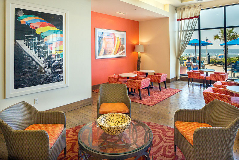
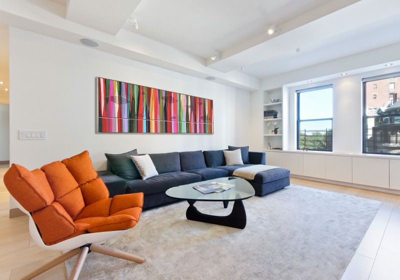
Here, orange is used as a moderate accent.
Tip. In the setting, according to the principles of Feng Shui, the orange color brings freedom and creation. Bring it your “problem” zone, be it family, children, health or finances.
Although orange furniture sets are not so common in catalogs and malls, buyers are eager to take them apart. But this or that shade is more consistent with the decor of a room of a certain functionality.
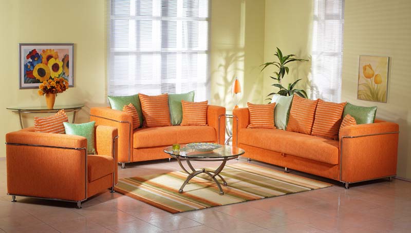
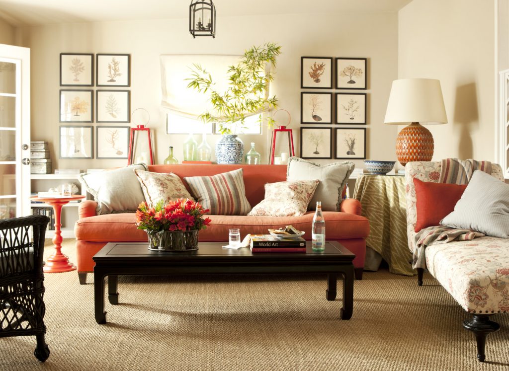
An orange armchair softens the cold and brightness of the white interior; the room becomes cozier and warmer
| 1. | Apricot | An excellent selection of furniture is in the modern bedroom on the north side, the walls are milky and white. |
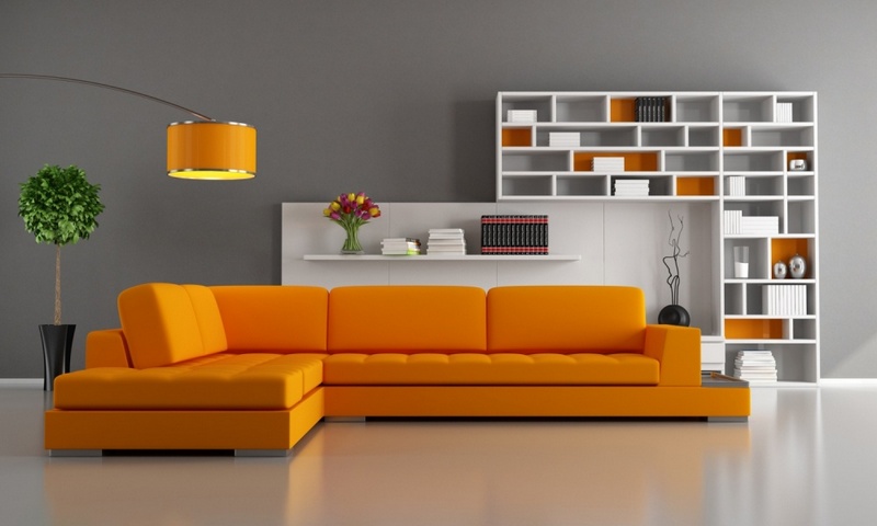
| 2. | Amber | A soft corner will decorate any living room. |
| 3. | Salmon | Nice upholstery for chairs in the girls room. |
| 4. | Terracotta | Wicker furniture on an open terrace or greenhouse with soft seats in this bloom. |
| 5. | Pumpkin | An excellent solution for the facades of a kitchen set or washable upholstery. |
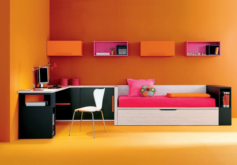
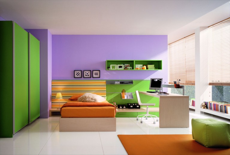
| 6. | Tangerine | Cheerful color for a children's bedroom. |
| 7. | Buffy | Calm shade, the best choice of hallway. |
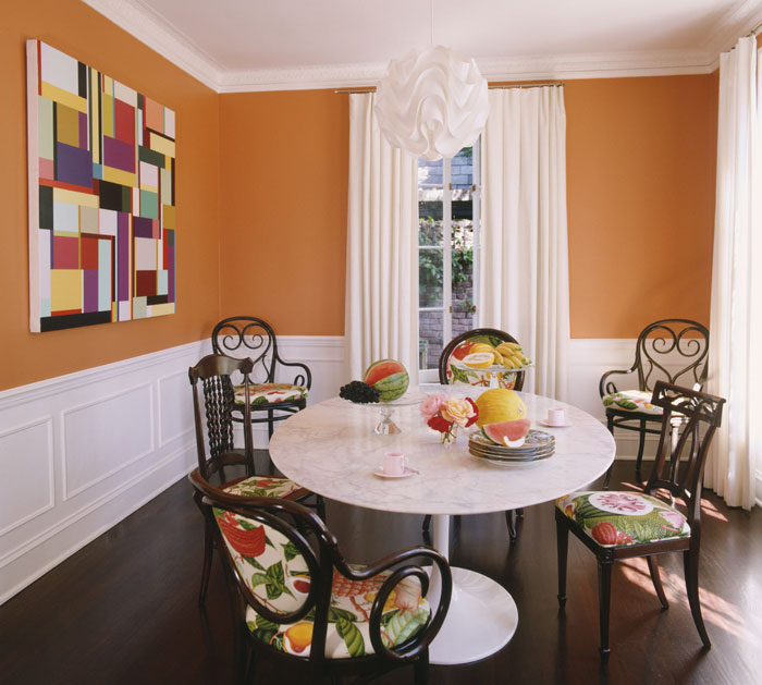
| 8. | Honey | Pleasant tone for a dining room set. |
| 9. | Red (fur) | Luxurious bedspread in the bedroom or living room. |
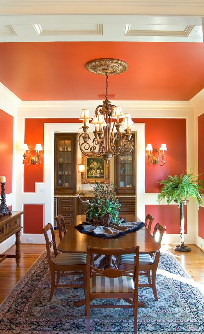
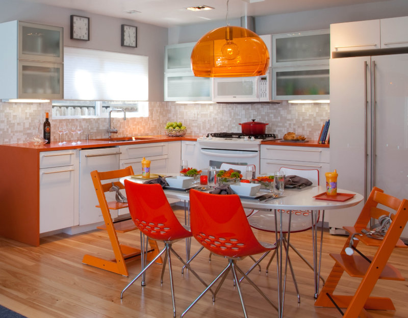
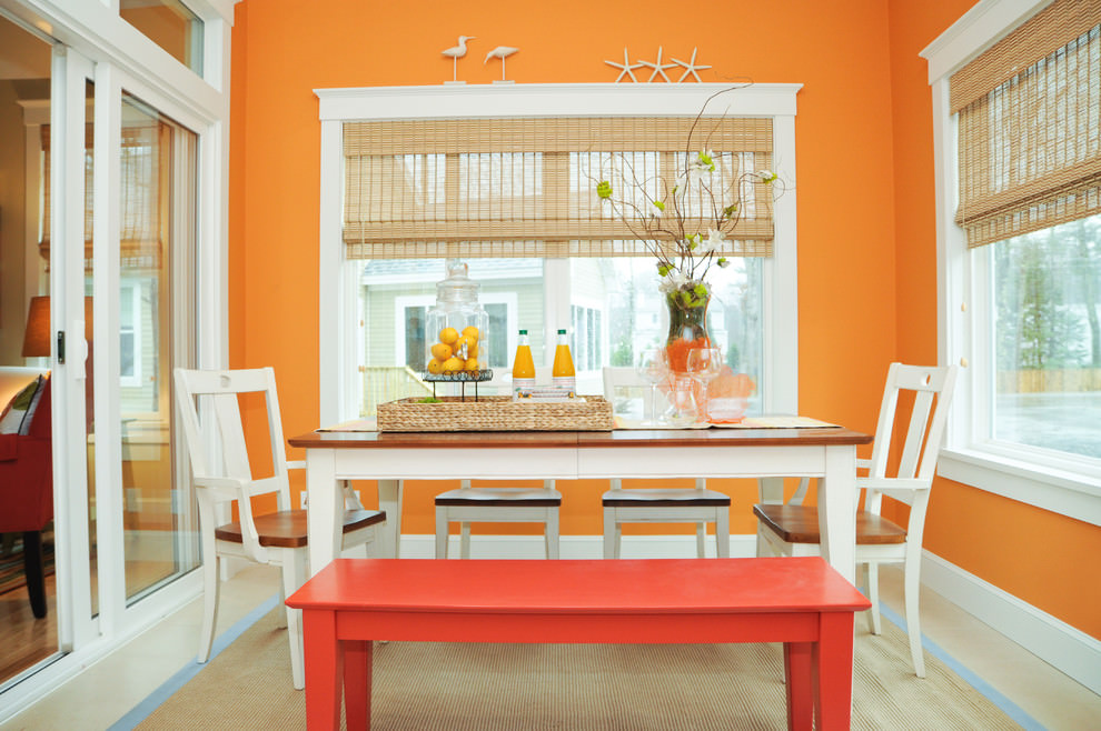
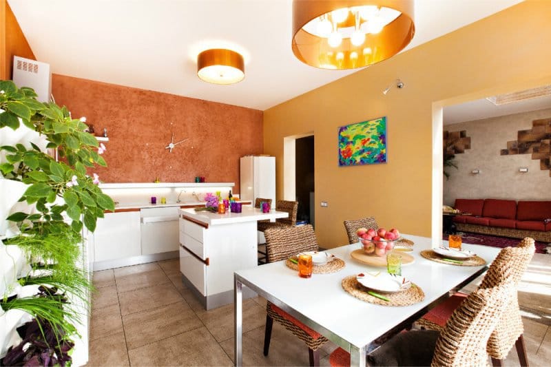
Orange color raises the appetite, so it is often used in the interior of the dining room or kitchen
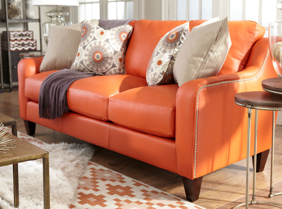
Stylish leather sofa with copper rivets
Of course, these are not all the shades that could be remembered and described. If you like a motley plain or leather sofa upholstery - buy, but do not forget about the overall color balance. Add accessories, souvenirs, marigolds or other fresh flowers in the same gamut to enhance your positive.
If the choice fell on the kitchen set in orange, apricot or salmon color - this is a great success, feel free to buy.The task is to design the kitchen with friendly colors. In priority:
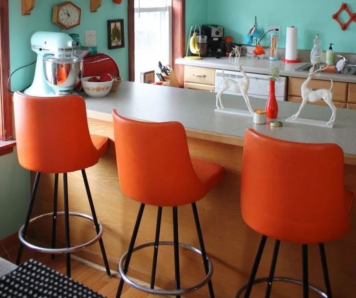
So the orange color looks in the kitchen in retro style
The shades of greens can vary, starting from light green and ending with olive and emerald. Much depends on the proportional ratio, so if you are not sure, then do not rush to change the tiling or washable wallpaper.
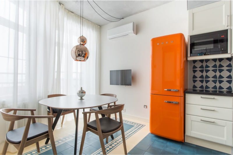
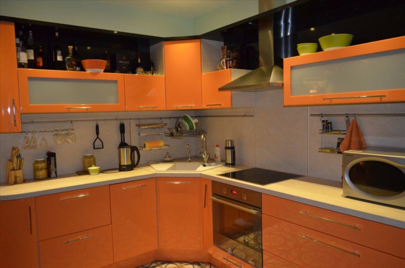
Orange refrigerator
Important! Facing a bright kitchen set will not look on colorful wallpaper or colored tiles. A bright background is a bust, you need a calm shade, preferably white or light beige.
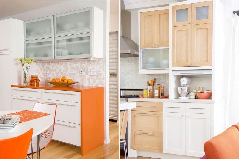
Orange countertop in the interior of the kitchen
The decor of the orange kitchen depends on the stylistic decision. If this is a Provence or country style room, you can add a decorative pumpkin in wicker baskets. Graceful copper jugs and trays with juicy fruits look much more elegant in the eastern interior.
Photo of an orange and white kitchen in a classic style
A modern interior can be decorated with panels of broken tiles, large prints or stickers with citrus motifs on the plastic facades of furniture.
For more successful examples of orange in the interior of the kitchen, nursery, living room and bedroom, see our gallery.